If you want to make movies, go to Hollywood.
If you want to make musicals, go to Broadway.
If you want to make apps, go to Appsterdam.
Mike Lee Mayor and founder of Appsterdam
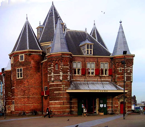
Appsterdam Bootcamp was a great event. For those of you who do not know when that was, it was on the 28th of September. Why was it great you're wondering? (Hope that's not a rhetorical question). It was great because there were a lot of people from many places around this big world, some were designers, some programmers some students and some teachers. Basically a lot of interesting minds together all under the roof of de Waag, and what a roof that was!
Visualization for public access and policy making - Elizabeth Turner
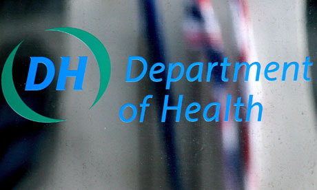
This was the first presentation of the day. It was really interesting to hear what Elizabeth Turner had to say about this topic.Apparently, the owners of this are:
- UK department of health
- Www foundation
- Www. Iconomical.com/company/projects
There are many things I got to learn during the presentation. Things like how 'data speaks for itself 'so there is no need to add anything other then the visualization. And the fact that in order to design a good DV the 'visualization must be simple' otherwise the designer risks sort of clogging the view of the viewer. Then again we are so used to DV that we do not even notice anymore how often we use it on a daily basis.
A great example of where DV is being used (probably made by the company where Ms. Turner works) is Plings.net or Plingorama. It looks like a great website meant for people of all ages and it contains information nicely visualized about things to do in the UK. The nice thing to note about this website is that the layers of information are organized in different ways and that is the basis of the interface for the DV.

Another great example was the website for Open spending in East Africa. Vizualizing budgets from African countries.This website is supported by NGO's and the point of it is to promote change through civil society.

Open Data Kenya project is a Budget explorer.It's Dashbord is complex, it is all about spending in developing countries. One hardship for designing a proper visualization for the budget explorer is the fact that classifications arent consistent.
To properly visualize different yet massive amounts of data, different chart types have been made for different types of data. Ex: how spending is distributed around the country. This allows the data to become explorable and discoverable.
When dealing with large amounts of data it is essential to filter the data: what data can you use or throw away but let the user decide what they want to see.
The website is powerful to use but harder to understand due to the many choices and different types of information.
Lex Slagerhuis in:
Hackdeoverheid.nl
The next presentation was that of Lex Slagerhuis about Hackdeoverheid. The principle behind Hackdeoverheid is to have financial transparancy in the Netherlands in order to see what the budget is and how it is being spent with other words in order to have open spending.The technical aspects would include 1 Api for all the governments, a superdatabase. This would allow citizens of this country to visualize the spending of the government.
Why would anyone want to do this and for whom?
At this part the presentation took an interesting turn. At first people were used to the idea of just watching/hearing the presentation. But then all of a sudden people became more active. Someone mentioned that for instance this would be interesting for during elections. That citizens have the right to see on whom they are voting and what that political party is using the budget for. Is a political party as good as they claim their word is? Transparency is good.
Another example was the case of fraud - think of preventing fraud bills.
It would also be useful for journalists to give clear data on which to base journals. Someone did mention that this would make for a "flatter world" a world in which so many people would ask for accountability that the government couldn't take any more steps.
Of course there were many more answers but people were talking too fast and it became hard to make notes at a certain moment.
Basically the day was very inspiring. I have learned from qualified and experienced people what intelligent ways there are for visualizing data and for creating these visualizations. I also feel that with the examples they provided I can myself better handle the tasks that the project this semester brings.
No comments:
Post a Comment